Affinity Designer
FPS
Sci-Fi
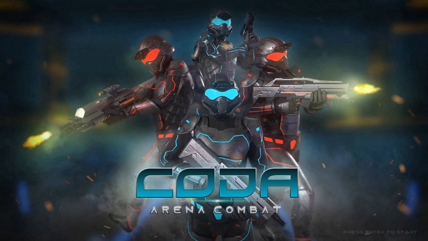
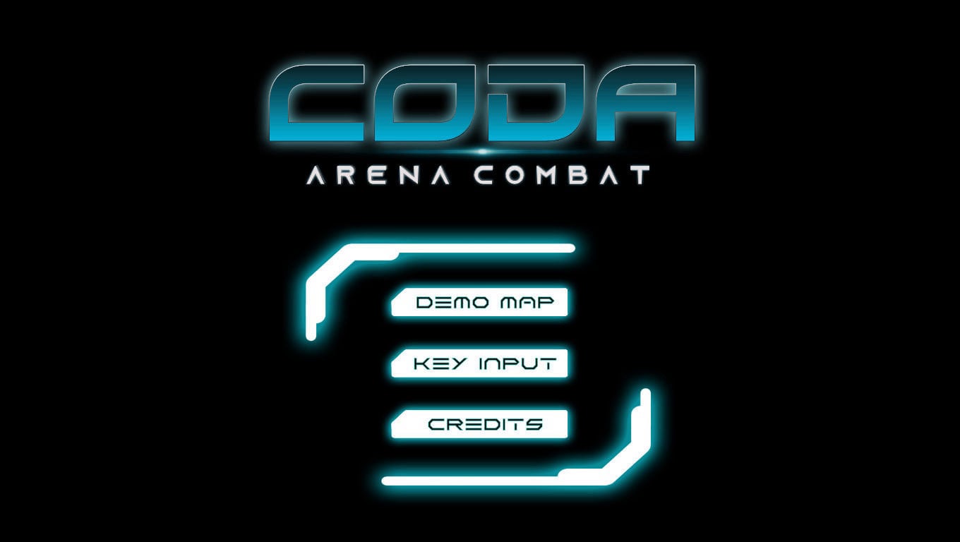
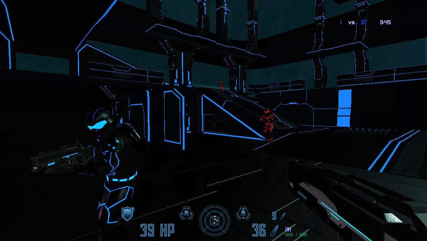
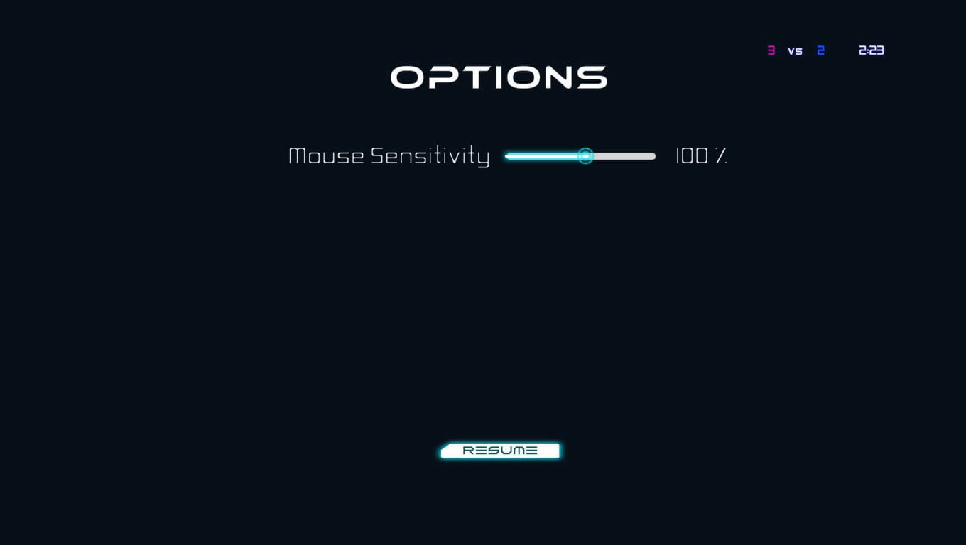
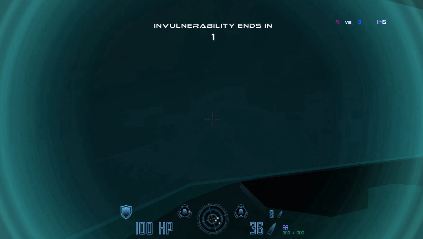
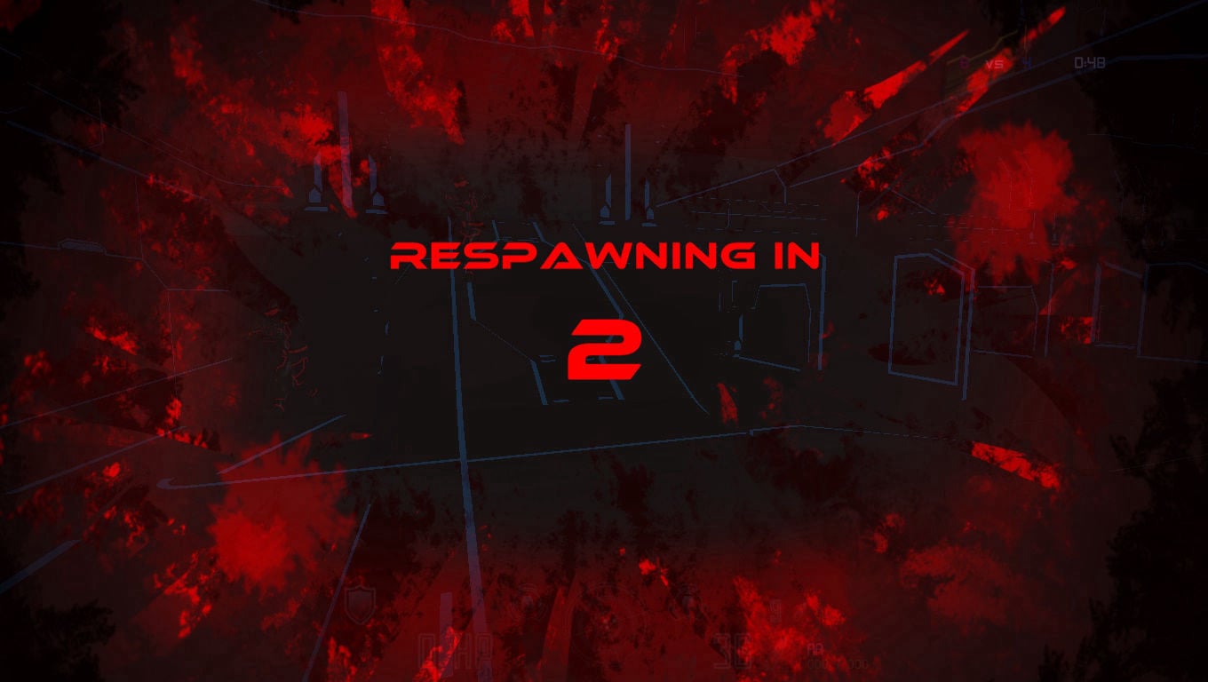
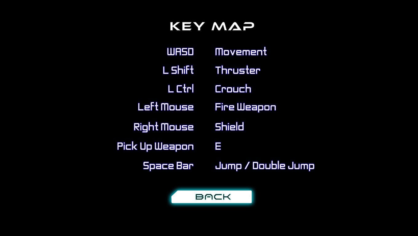
I led the UI and UX design for Coda: Arena Combat, a fast-paced, first-person arena shooter inspired by Halo and Splitgate. The core challenge was to design a complete player experience that was intuitive and frictionless. My goal was to support the game's intense, rapid-fire gameplay with an interface that was not only visually striking but also highly functional, allowing players to stay immersed and focused on the action.
 Offline Website Builder